

Data is one of the key factors for businesses to identify its operational strengths and weaknesses. The key insights from data analysis can point out opportunities to boost performance and efficiency. Therefore the data-driven designing remains as much of an art as it is a science, especially for customer-facing applications with both a large number of users and large datasets. How an application presents data plays a huge role in UX
Following are some of the tips and tricks to develop simple and clear data-visualization for app dashboards, web pages, and so on.
UNDERSTAND CUSTOMER JOURNEY TO DELIVER RELEVANT DATA
Enabling customers to create their digital persona such as managing their accounts, checking their usage, and personalizing their services, etc is a game changer.
The three checkpoints that need to be considered are:
Inform: Customers pay attention when they’re offered helpful and useful data. For example, a travel booking tool that analyzes historical data to advise customers on when to purchase travel.
Connect: Data-driven apps and personalized experiences can connect users to brands. For example, an online shop that uses QR codes and a mobile app to blend advertising and online shopping.
Motivate: The ultimate goal of data is to influence customer behavior. Together, data and context drive participation and engagement.
EMPLOY USER PERSONAS TO DESIGN USEFUL DATA-DRIVEN DASHBOARDS
As much as artificial intelligence and machine learning will keep improving, most organizations will still need human intervention to crunch uncategorized data. Data-driven applications tend to be used by multiple persons within or outside of an organization, you need to identify those personas so you can organize your information architecture wireframes and tasks to meet everyone’s needs.

Here every user/persona has different taste in the data visualization, but the design takes care of each users interest
Erik Klimcz, the Senior Design Leader at Uber and Advanced Technologies Group, shared some actionable tips on Medium. He suggests UX designers need to first identify, then define users or personas for every project.
ACCESSIBILITY OVER AESTHETICS
It’s not just about making heavy, contextual data fluid and appealing. You also want to design data presentations that provide clarity on the following
Users should know what data is the most important: One vital UX design principle is to observe and implement a hierarchy of information – in this case, visual hierarchy. You want to organize, arrange, and prioritize the most important data first, and additional data later. Of course, the order of priority will vary depending on the application’s user. Not only does doing this declutter the dashboard, but it also helps direct the user’s focus on what’s important to them in an easy to follow, less overwhelming way.


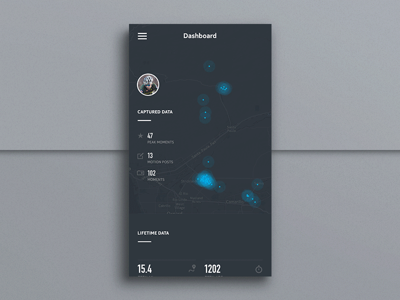 In the above example, we notice the captured data is given higher priority, followed by lifetime data and goes further to activity breakdown
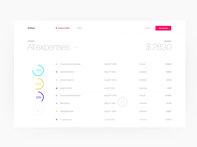
Users should be able to comprehend the logical flow of data: Simplicity plays a major role in helping the user to connect the data to a certain outcome. You can add an intuitive drop-down menu, which when the user clicks, slides down to reveal additional information, and then specific tasks or items. People love this, and it’s gaining popularity already.
You can use clickable links or rollovers to reveal more information. Also, functions such as slide-to-reveal data and zoom-in-to-reveal are great ways to include additional information or highlight key data points. All using simple, natural gestures. This allows users to click on the links or rollovers they perceive as important to their job and leave the ones they consider less important.

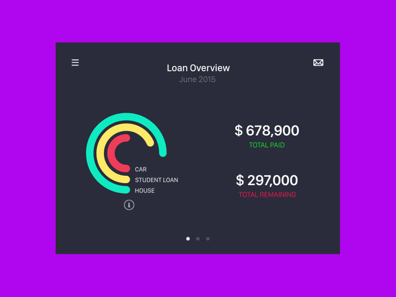
This example shows a simple, elegant and comprehensive view of the data using various interactive functions
Use hover animations: You can use hover animation effects to add more zing, engagement, and usefulness to the (seemingly) dull data. Hover animations are particularly actionable for supplying additional information on specific tasks or items while helping to organize and clean up your data-driven application.
Users should be able to understand what the data means: After organizing and prioritizing data on the dashboard, the next step is to break down the data into separate pages. If it is possible to categorize the information, be sure to allocate different pages/screens for different data bundles.
Users should be able to understand the next step to take: Following hot on the steps above, it becomes easier for users to identify and relate patterns in the raw data – another key win to aim for when designing for data-heavy applications. When the data visualization tools you use help the users to make sense of big data, that’s when you know you have done a great job.


CONCLUSION
The purpose of UX design is to convey a message in a clear and actionable way. This is especially crucial for designing data-heavy applications. In this case, the business of good design is to help analysts or managers or end users make an informed decision. And users cannot interpret and use raw data to inform a decision if they do not make good sense of it and how it is presented. Designing for data-heavy UX projects should not be as exasperating as it seems. The above tips and tricks can help you figure out how to design for data-heavy interfaces.


No comments:
Post a Comment